
Looking Ahead: Design Trends I’m Actually Excited About for 2026
Trends come and go—but good design? That lasts.
And let’s be real: half the “trends” floating around Pinterest right now will be gone before your remodel is even finished.
That’s why I don’t jump on every passing style wave. I filter them through experience, intentionality, and real-life function. My clients aren’t hiring me for a Pinterest copy-paste—they’re hiring me because I’ll say, “Sure, this looks good... but we can do better.”
So here it is—my honest, no-fluff take on the 2026 design directions I’m genuinely excited about. These are styles I see sticking around for the long haul, and they align with what I’m already creating for clients: personal, layered, and unapologetically good.
1. Mixed Neutrals Are the New “Safe Choice” (But So Much Better)
Gray is no longer the default, and thank goodness. I’m loving this shift toward warm, moody neutrals—think taupe, mushroom, clay, camel, and even muddy ochres—all layered in a way that feels intentional, not accidental.
This isn’t beige 2002. It’s textured, tonal, and quietly luxurious. The palette works best when it includes contrast—light and dark, soft and structured. If you tell me you want a neutral space, I’m going to push you past builder-basic into something that actually feels alive.
Warm neutrals…in. Gray…out.
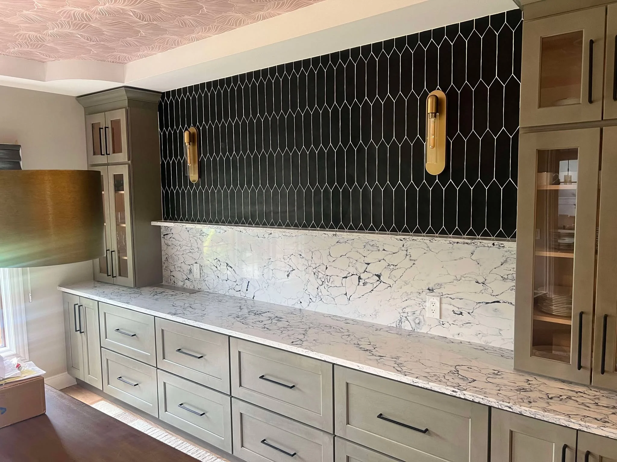
2. Bold Stone Moments (That Aren’t Just for the Kitchen)
If you know me, you know I have opinions about stone.
I’ve never been one to settle for basic quartz. And right now, I’m obsessed with the rise of natural and natural-look stones—with big movement, moody veining, and unpredictable beauty.
But here’s the twist: we’re not just using them on countertops anymore.
Full-height backsplashes, dramatic fireplace surrounds, floating vanities—stone is finally being treated like the art it is. And I love helping my clients take it somewhere unexpected.
This is one of those places where a splurge is 100% worth it when it’s done right.
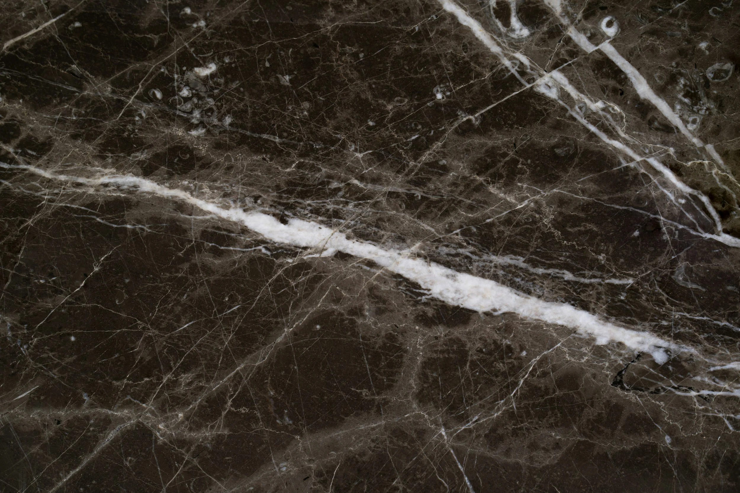
Moody marble is my recent favorite for every project! It’s a different variation every single time.
3. Plaster, Clay, and Imperfect Texture
One of the best things to happen in recent years? We’ve finally moved past the “everything must be sleek and sterile” phase.
Plaster, limewash, and clay textures are bringing depth and softness back into spaces—and the beauty is in the imperfection.
When a wall has movement, when a finish feels touchable, it adds so much more than a flat paint ever could. I’m bringing these textures into range hoods, powder rooms, and even ceiling details. And it always makes the space feel curated—not cookie cutter.
If you’ve ever walked into a room and felt calm without knowing why, it was probably the texture doing the heavy lifting.
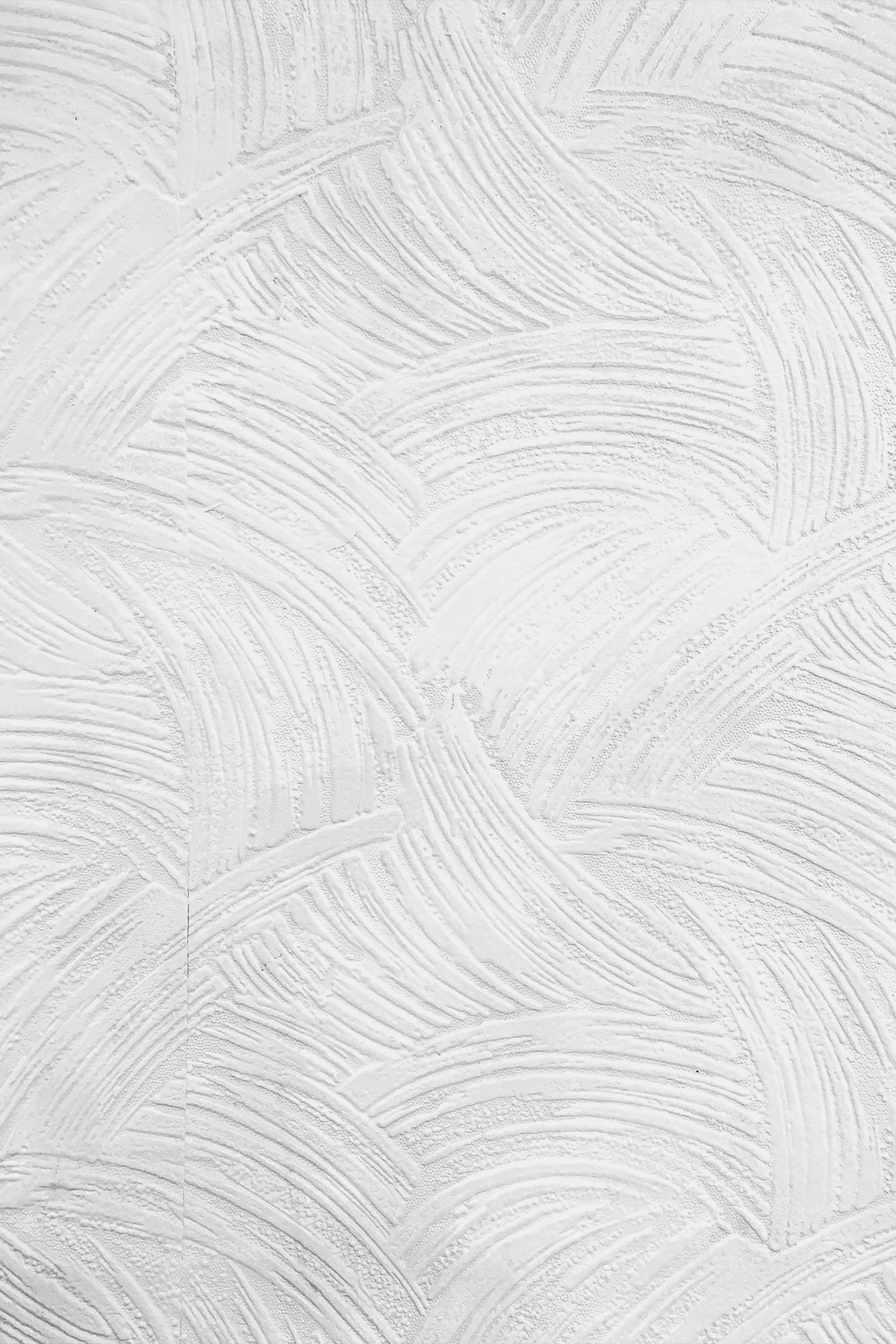
Plaster and limewash add a dramatic flare to any space.
4. Built-Ins That Look Good, Work Hard, and Make the Room
The days of shoving a bookcase against a wall and calling it storage are done.
Built-ins are back, and they’re smarter, sleeker, and more intentional than ever.
I’m talking about arched cabinetry flanking a fireplace, reading nooks with layered lighting, dining room hutches that look like furniture, or bar areas that feel more like design moments than utility.
Built-ins are one of my favorite ways to architecturally anchor a space—especially in open-concept homes that need zones, not chaos. And when they’re done right, they make the entire room feel elevated.
Bold built-ins are a must in most of my remodels!
5. Rich, Saturated Color Palettes (That Still Feel Livable)
I will always love a soft, neutral space—but lately I’ve been loving the move toward deeper, more emotional colors. Think olive green, charcoal navy, russet, espresso brown, even dusky mauves.
Used well, these colors don’t overwhelm. They ground a space. They bring character. They photograph beautifully (if that matters to you). And they age well, because they’re not trying too hard.
The secret is balance: if I’m bringing in a rich color, I’ll layer in texture and light to keep the space breathable. It’s about contrast and composition—not just color for color’s sake.
Rich, moody colors are coming up and I am all for it!
And What I’m Not Loving for 2026…
All-white everything. Sterile doesn’t equal timeless. It just feels cold.
Ultra-minimalism. Beautiful in magazines. Lifeless in real homes.
Theme-y designs (especially TikTok trends in real estate). You’re not a trend—you’re a whole person. Let’s design accordingly.
Final Thoughts
Trends are just tools. They’re not the blueprint.
When you work with me, I’m not here to give you what’s hot—I’m here to give you what’s yours. Something layered, smart, and future-proof. Something that still feels like a hell yes years from now.
So if you’re ready to explore the possibilities—and maybe hear me say “let’s do better”—I’m ready when you are.
📍Based in Colorado | Working with clients locally and remotely
Let’s make something incredible.